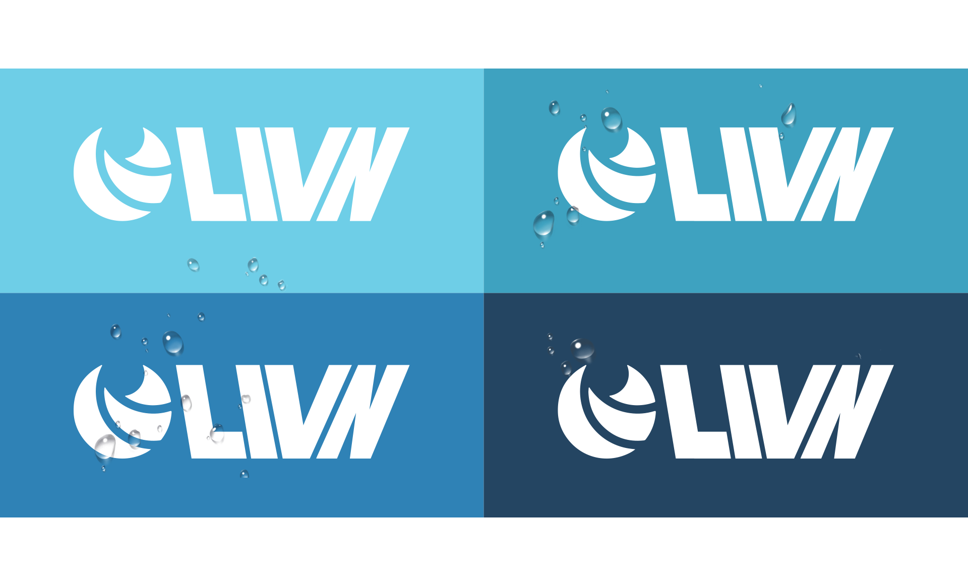
Branding
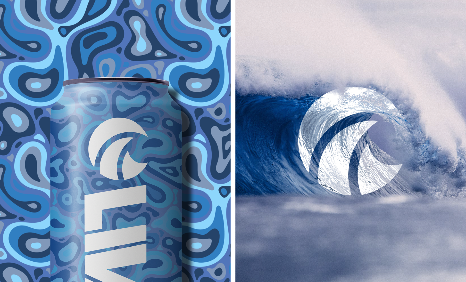
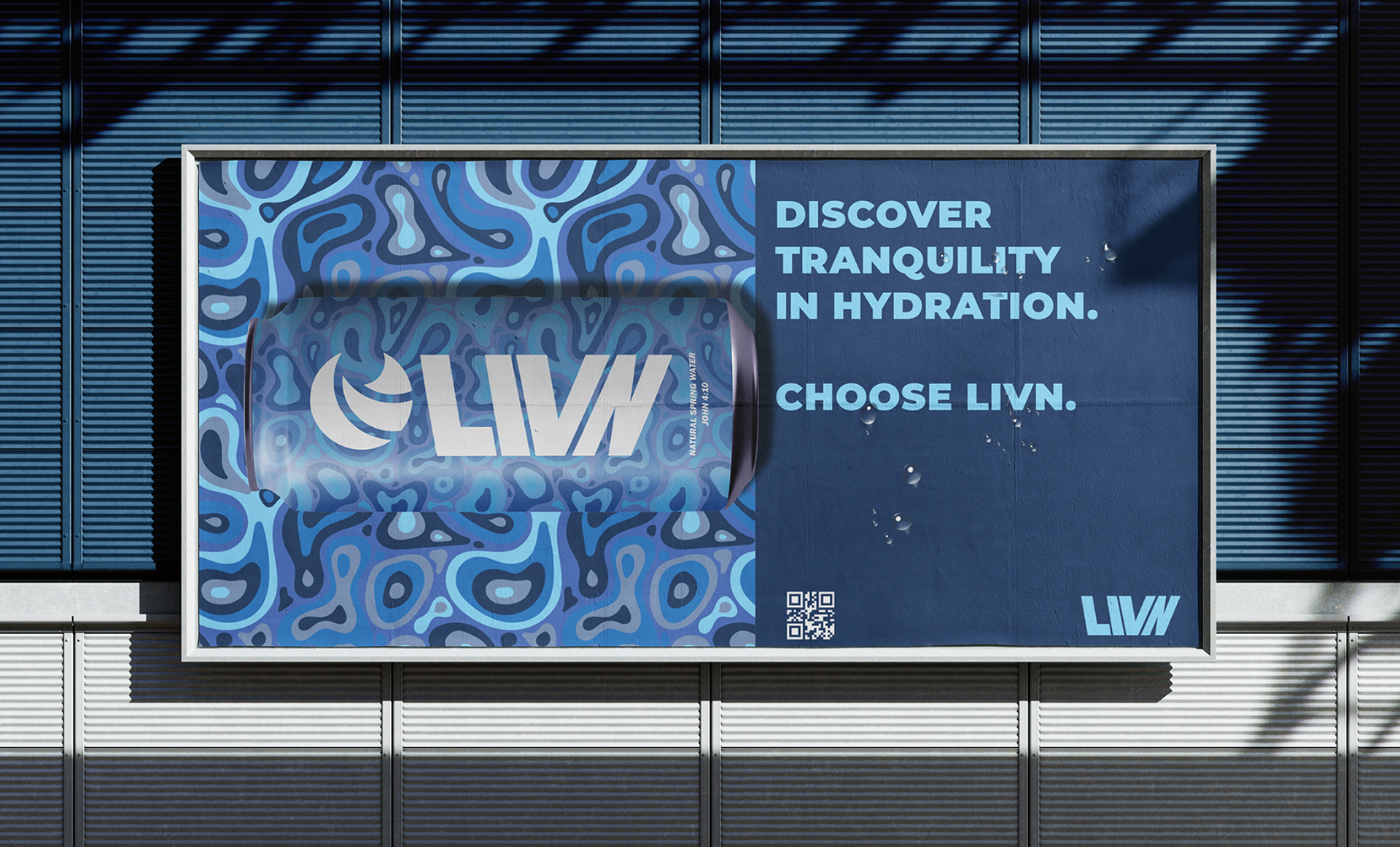
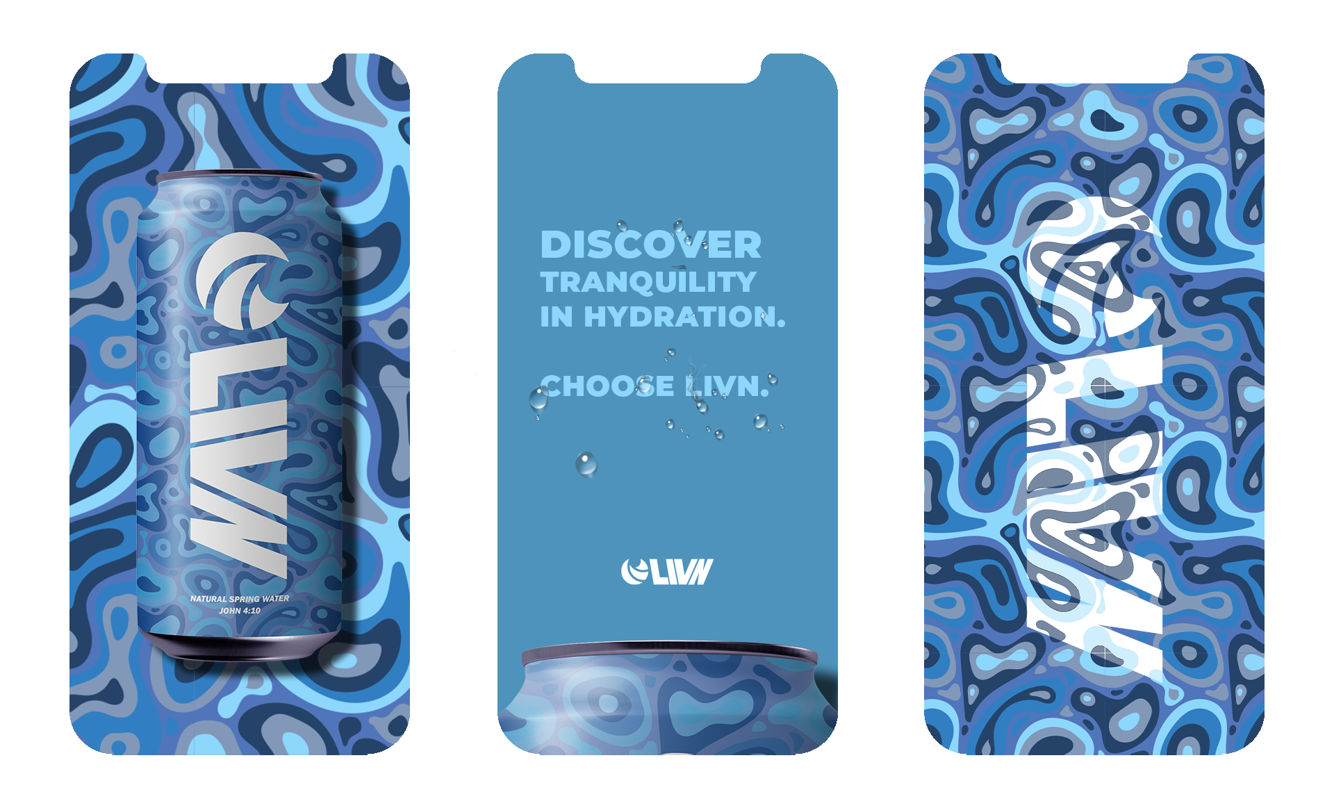
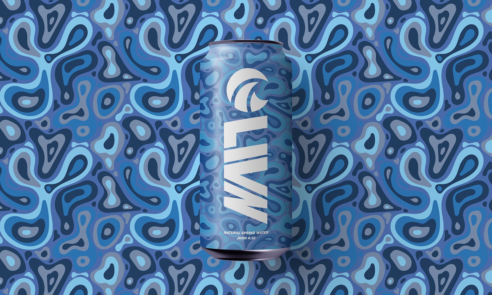
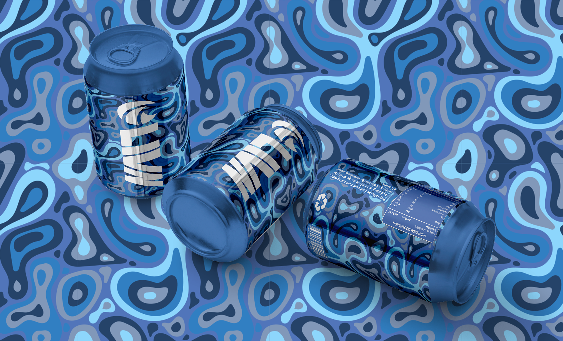
Inspired by the dynamic nature of liquid and the refreshing feel of water, I chose colours that mirror the tranquil hues of the ocean and the vibrant shades found in sea life. This choice reflects the brand's youthful and energetic demographic, symbolising a sense of vitality and freshness.

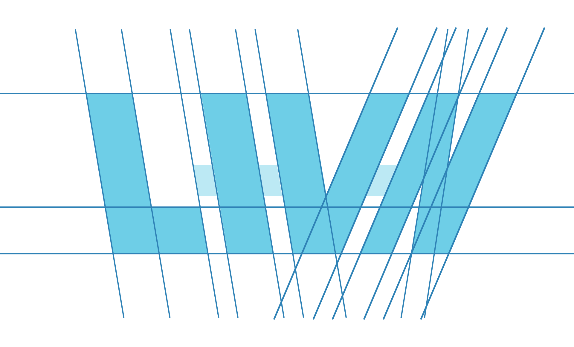
Logo Process
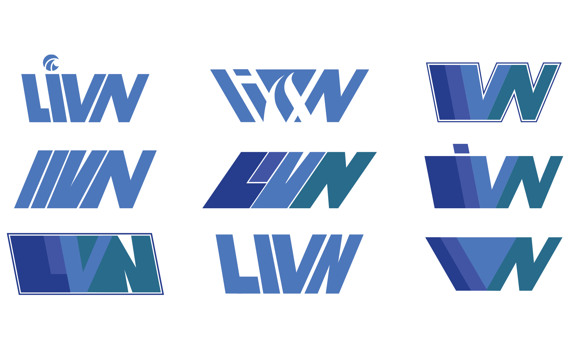
In directing the artwork, my aim was to emulate the beauty of ocean sea life, drawing a parallel to water and hydration.
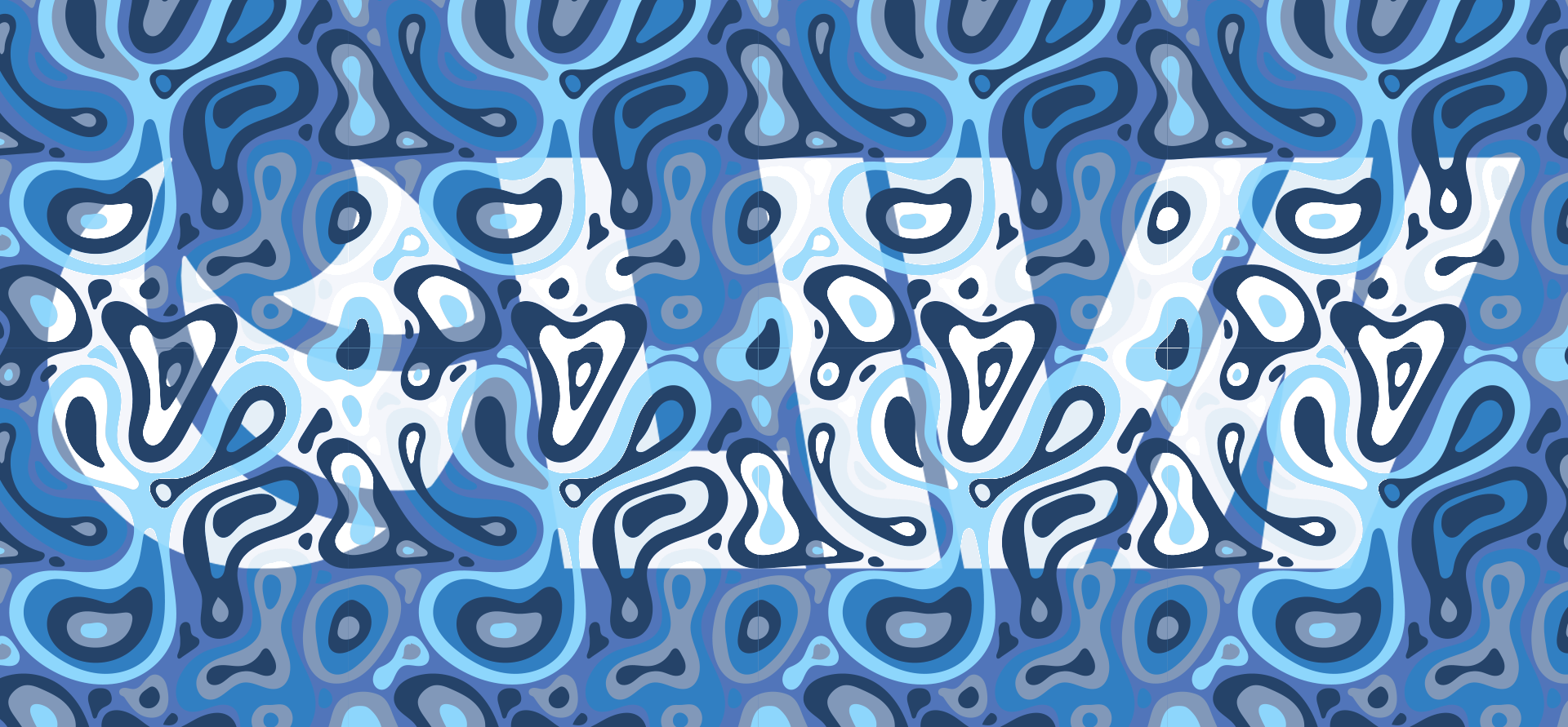
Product Design
Crafting a print that smoothly enveloped the product without visible cropping posed a challenge that I tackled through experimentation. To address this hurdle, I used Adobe Illustrator's tools, particularly the Repeat Grid tool. This tool offered several advantages: direct control, simplicity in pattern adjustment, suitability for testing before finalising the outcome, easy scalability of the tile, and preservation of the pattern in vector form within Illustrator.
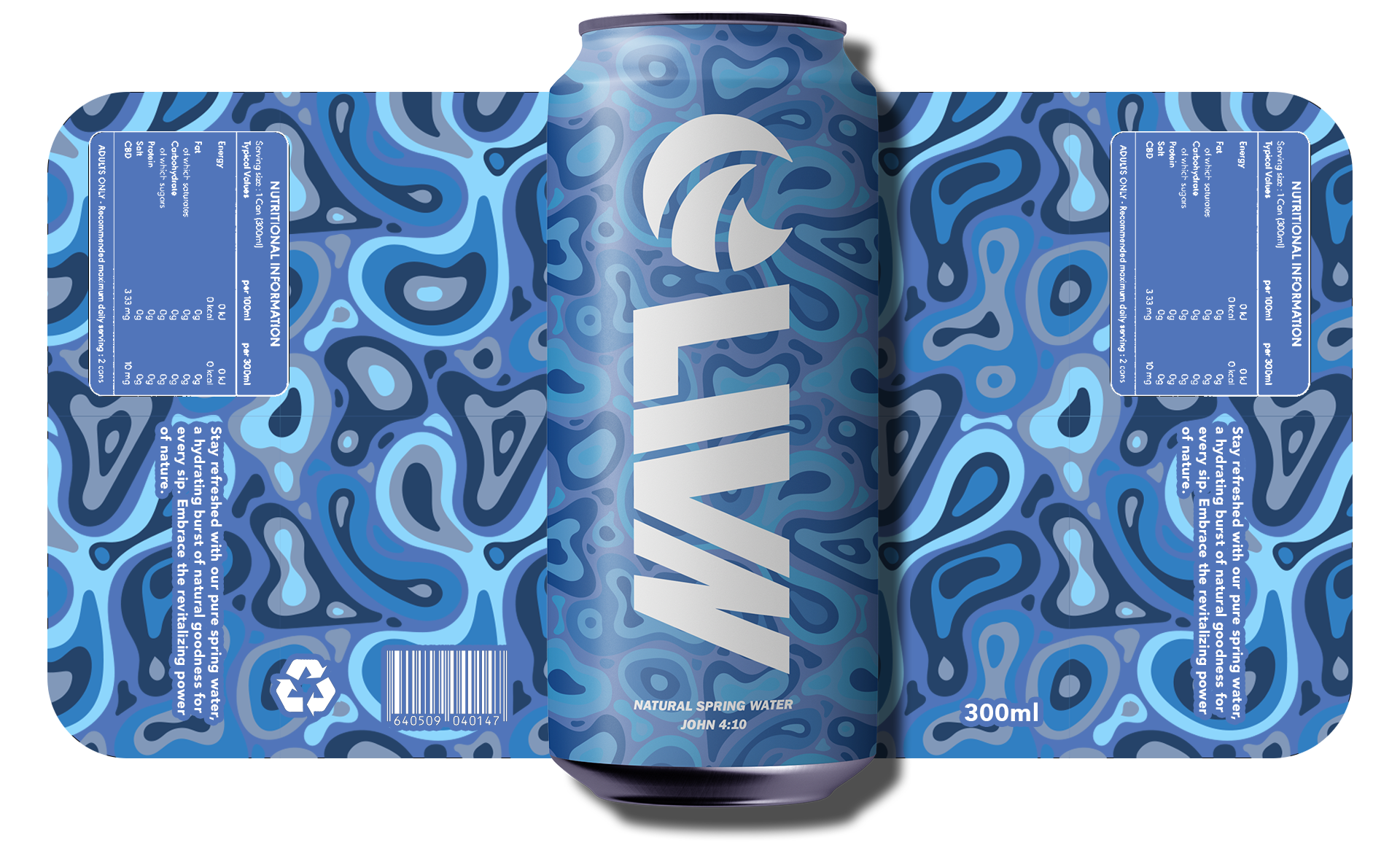
Brand identity